Five stunning outdoor spaces for all
There is a creative boom in outdoor architecture and design. Dominic Lutyens explores how newly completed public areas are offering a sense of release and relaxation.
W
Wide open spaces – squares, gardens, plazas and parks – have always been appealing oases in bustling cities. They are places to socialise, or to indulge in solitary reading and sunbathing. Now more than ever they are synonymous with freedom, providing a sense of release and respite from domestic confinement. And with social distancing a reality for many of us, spending time in large outdoor spaces is good for our health in more ways than one. We suggest several spectacular outdoor projects created by architects and landscaping experts that will satisfy our hankering for space – and shed light on new developments in urban design.
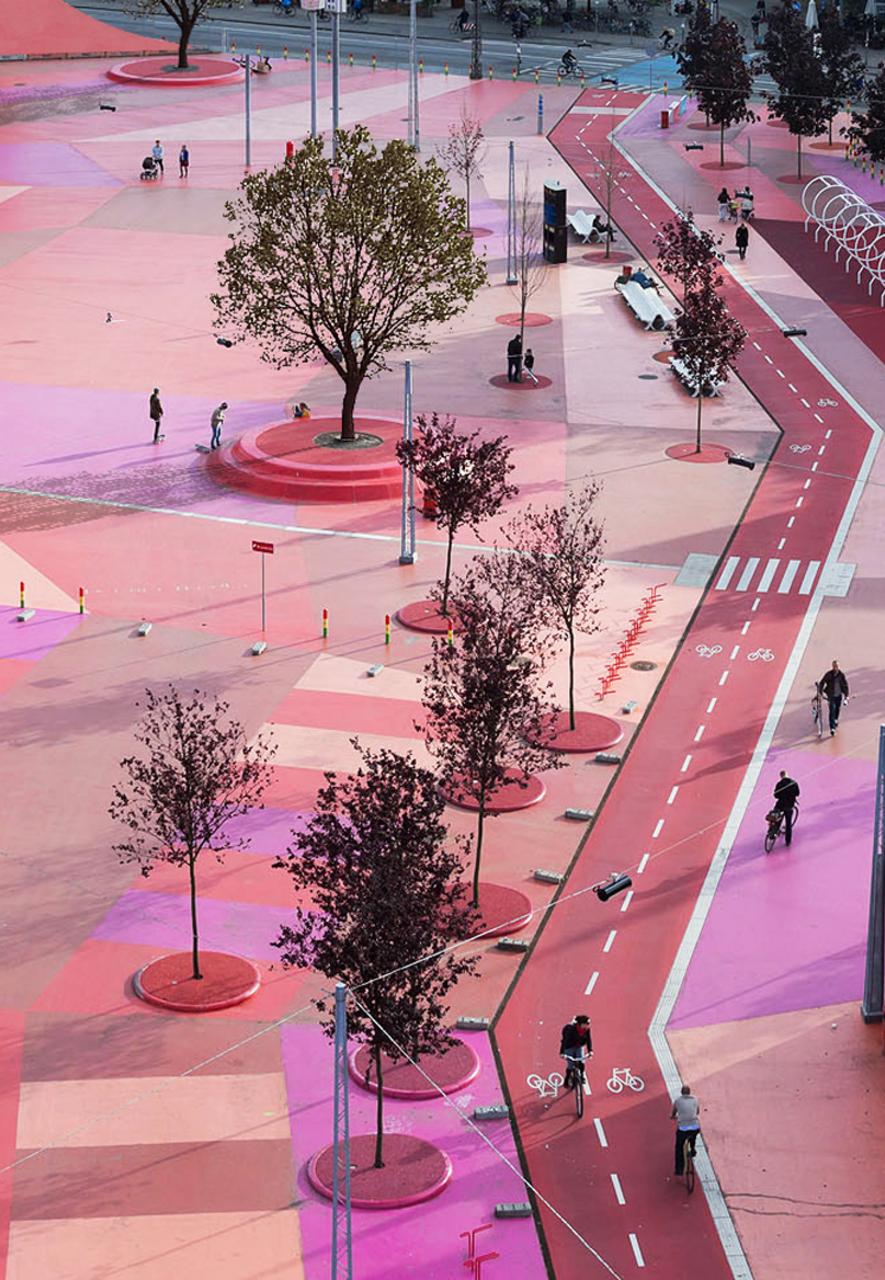
Superkelin is a 1-km-long urban park created by Danish architects BIG and landscape architects Superflex (Credit: Iwan Baan)
Superkilen, Copenhagen
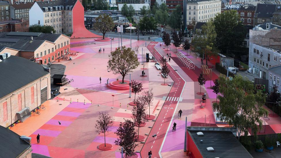
Conventional street furniture has no place in Superkilen, an extraoardinary 1km-long paved space billed as an ‘urban park’ in Norrebro, a neighbourhood populated by communities from more than 60 countries, north of Copenhagen’s city centre. Combining sports facilities with children’s playgrounds and abundant seating, it’s zoned into colour-coded areas — shocking pink, red and orange squares — denoting different activities. Adjacent buildings are partially painted the same shades, creating the illusion that the space is bigger than it is.
The project was initiated by the city of Copenhagen and Realdania, a private Danish association that funds architecture projects, and was designed by high-profile Danish architects Bjarke Ingels Group (BIG) in collaboration with landscape architects Topotek1 and artists’ collective Superflex.
The space at Superkilen has been coloured in shocking pink, red and orange (Credit: Torben Eskerod)
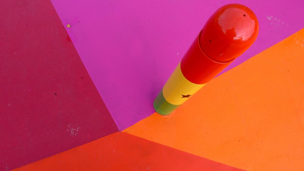
Unusually, an extensive consultation with local communities resulted in the inclusion of objects they particularly cherish, from a Moroccan fountain and workout machines like those on Venice Beach, Los Angeles, to neon signs from Qatar and Russia. A metal plate embedded in the ground beside each object names it and explains its origin.
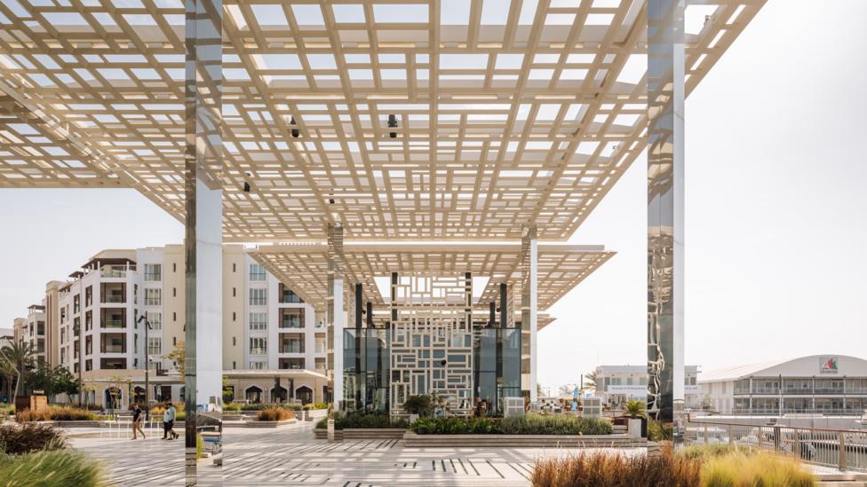
The Marsa Plaza was designed by London-based architects Acme, and features latticework and stone canopies (Credit: Francisco Noguera)
Marsa Plaza, Oman
The recent expansion of Muscat, the capital of Oman, along the coastline has seen the creation of a new port, marina and its multipurpose Marsa Plaza. London-based architects Acme won an international competition to create the latter — a 5,000-sq-m space, completed in 2018. The plaza is bounded on two sides by medium and low-rise buildings, and overlooks the marina and sea. It features fountains and an amphitheatre used for concerts and movie nights, and hosts food markets and art exhibitions. “The new buildings’ footprint was restricted to maximise the outdoor area,” says Duarte Lobo Antunes, one of the project’s architects.
“Oman has a very laid-back culture and is a popular holiday destination in the Middle East,” continues Lobo Antunes. “In Muscat people usually socialise in the evenings, particularly from May to September when, during the day, they avoid places without shade.”
The square’s buildings feature latticework and projecting canopies made of a stone called desert rose in neutral tones, from cream to brown, that provide varying degrees of shade as well as glimpses of the sea. Steps lead towards the marina, adding to a feeling of limitless space. The square’s graphic lines nod to patterns traditionally found on floors in Oman. “The square reflects the informality of Muscat. It’s a place where people can meander and gather in different spots,” adds Lobo Antunes.
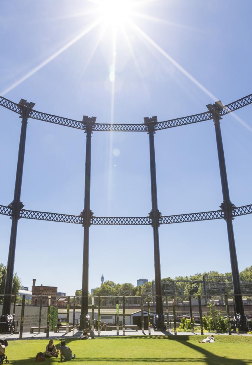
A grassy area landscaped by Dan Pearson offers a relaxing oasis in the city (Credit: John Sturrock)
Gasholder Park, London
Gasholder Park in King’s Cross, London, fuses a vestige of 19th-Century industrial architecture — a disused Victorian gasholder — with a new pavilion, designed by Bell Phillips Architects, and pastoral landscaping by Dan Pearson. The project involved dismantling the gasholder’s 250m-tall, circular guide frame with a 40m inner diameter from its former location (now public space Pancras Square) and moving it to a spot overlooking Regent’s Canal.
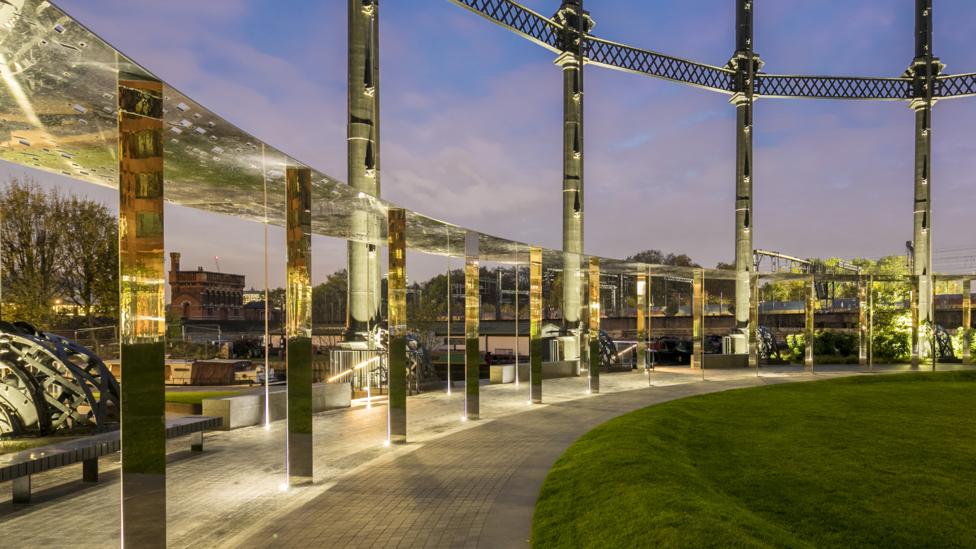
Gasholder Park blends 19th-Century industrial architecture with a new pavilion by Bell Phillips Architects (Credit: John Sturrock)
This union of old and new doesn’t jar, thanks to Bell Phillips’ addition of a circular, polished-steel colonnade with a canopy that runs round the guide frame’s inner perimeter. These concentric circles enclose a large, lush, grassy area planted with cheerful yellow and white flowers. Light reflected from the mirrored surfaces has the effect of softening, even dematerialising them. Every evening, cool white lighting inspired by a solar eclipse, created by lighting designers Speirs and Major, illuminates the structure in 20-minute cycles, interspersed with dramatic, two-minute periods of darkness.
“Some parts of the park feel secluded, some more active, with joggers and children playing near their parents – there’s a school nearby,” says Hari Phillips, co-director at Bell Phillips. “The lockdown has made us realise how precious open spaces are, particularly in high-density cities.”
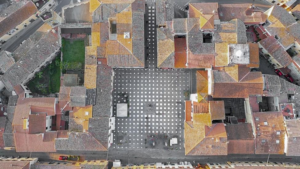
The StoDistante installation in Tuscany was created by Caret Studio (Credit: Giulio Margheri)
StoDistante, Italy
Completed last May, StoDistante (‘I’m keeping my distance’ in Italian) is an installation in Vicchio, near Florence. Many famous Italian artists were born near this 13th-Century town, including Giotto who gives his name to Piazza Giotto, one of its squares. Now this new installation, created by local architects Caret Studio, is bringing the square firmly into the 21st Century by addressing Tuscany’s current social-distancing regulations.
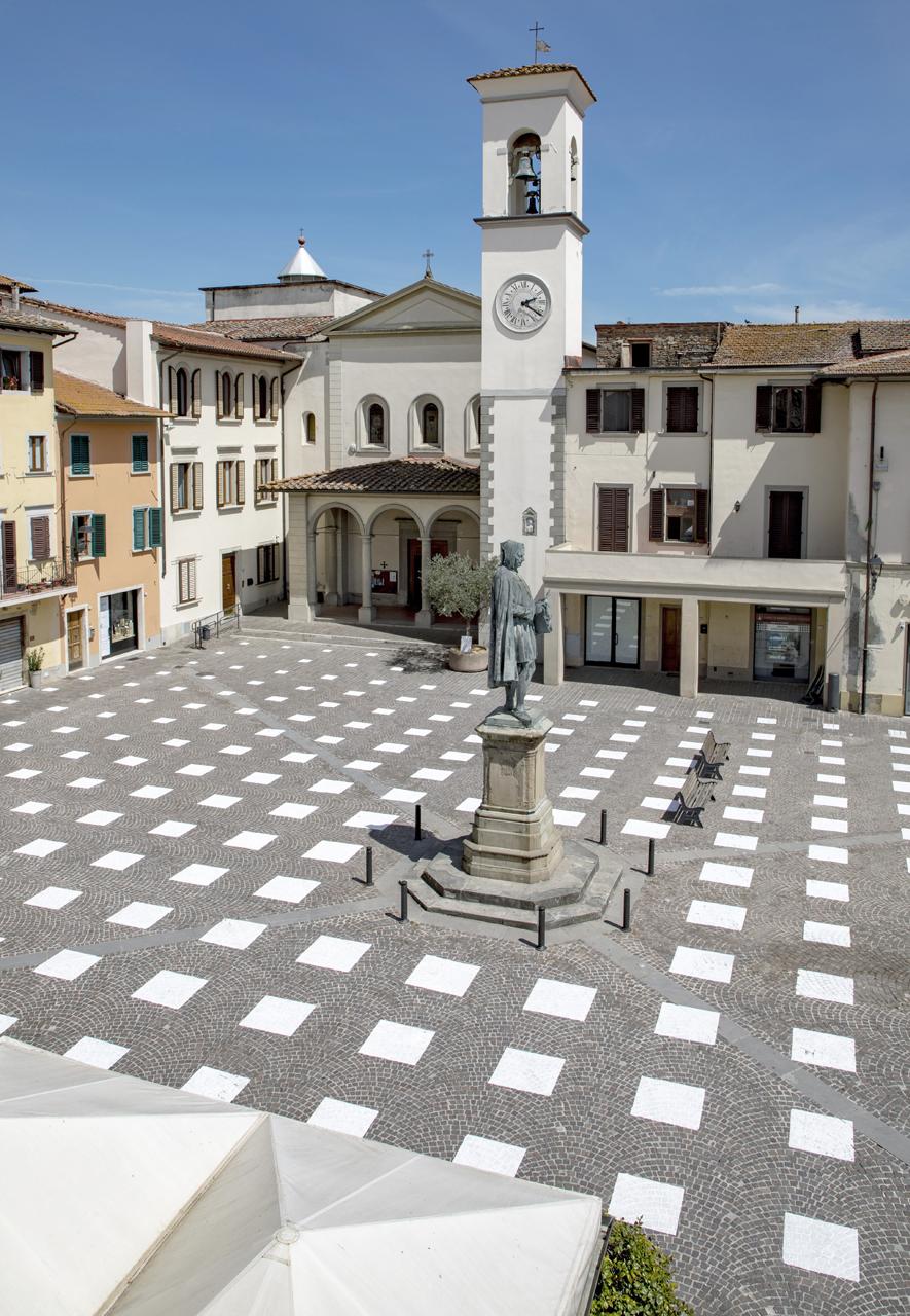
The painted grid pattern blends with the picturesque setting of the square (Credit: Giulio Margheri)
Caret Studio’s understated intervention offers an elegant solution to social distancing without detracting from the picturesque setting of the square: it has painted a grid pattern of white squares directly on to the cobbled ground using white removable paint. “The squares creates a grid to guide people’s movement around the square safely,” explains Giulio Margheri, who co-founded Caret Studio in 2014 with Matteo Chelazzi and Federico Cheloni, two of whom were born in Vicchio. “People know that when standing in each white square they are 1.8m away from the centre of the next one.” The hope is that the space will be used as an open-air cinema and gym as restrictions on public gatherings are eased in the near future.
“The municipality of Vicchio supported the project from the start,” recalls Margheri. “We see StoDistante as a design strategy that could be deployed in public areas in other towns and cities, allowing citizens to reactivate open spaces post-lockdown.”
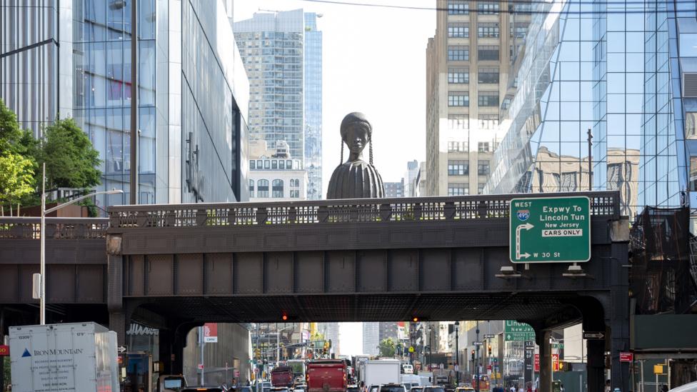
The Spur is the final addition to the High Line, and features a monumental sculpture by Simone Leigh (Credit: Timothy Schenck)
The High Line, New York
When Ricardo Scofidio, a partner of New York architecture practice Diller Scofidio + Renfro, first became involved in the High Line project in 2003, he had a vision of preserving the untouched qualities of this elevated structure that fell out of use in 1980. This disused viaduct section of the New York Central Railroad line, known as the West Side Line, had evolved over the years from a post-industrial relic to a fertile habitat for plants thriving in different microclimates.
Scofidio, who repurposed the line into a park in collaboration with James Corner Field Operations and planting designer Piet Oudolf, didn’t want to suppress nature: “We didn’t want the plants to be imprisoned by hard-edged kerbs but blur the line between plants and hardscape,” he recalls. “We encouraged the plants to overtake the structure, to grow through the cracks.”
Now this major New York attraction with views across the Hudson River boasts benches made of stretches of track, 120 plant species and birch trees providing shade.
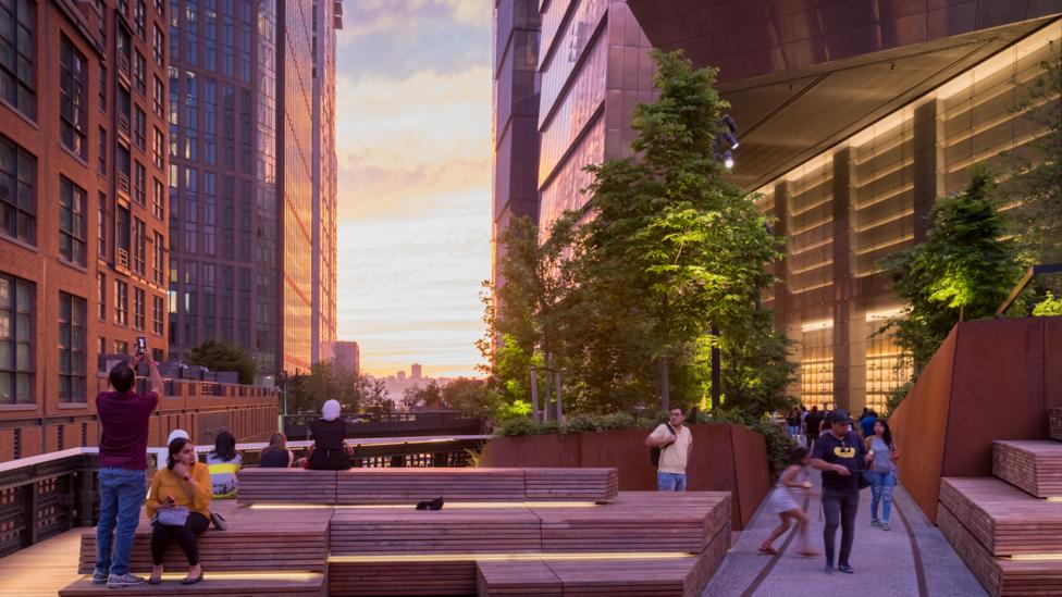
The High Line successfully blends nature and architecture (Credit: Iwan Baan)
The last section of the line to open, the Spur, which extends along 30th Street, was designed by the same team, and opened last year. However, here culture has taken the upper hand over nature: at this juncture, the line swells into a large plaza –where monumental art pieces take centre stage; the inaugural piece is Simone Leigh’s Brick House, a sculpture of a black woman whose torso morphs into a clay house. The Spur is also a music venue. The plaza also features stylised elements, including gigantic tilted planters. As James Corner puts it: “This dramatic space is flanked by generous seating and overlooks and immerses you in the massive scale of the city, opening up new vistas”.
If you would like to comment on this story or anything else you have seen on BBC Culture, head over to our Facebook page or message us on Twitter.
And if you liked this story, sign up for the weekly bbc.com features newsletter, called The Essential List, a handpicked selection of stories from BBC Future, Culture, Worklife and Travel, delivered to your inbox every Friday.

